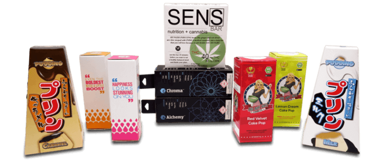
Selling cannabis products? Looking for something to help your products stand out? Look no further—here are some tips and trends we’ve seen from our previous clients that might help your product put its best face forward:
Try unusual shapes
This one is self-explanatory and a must-try if you have the budget, the audacity, and the determination to shape your brand as such. Having unusually-shaped packaging is not just more memorable—it also impresses upon them your company’s creativity and devotion to its ideals—traits that can win them over more easily than product copy. One thing to keep in mind is that while unique boxes almost always look gorgeous, many types either cannot be stored compactly or are prone to falling over. However, many unique box types we carry are just as practical as regular boxes because they tessellate without any problems—meaning that like regular boxes, their shape allows them to fit together in a perfect pattern.
Use Classic Symbols and Imagery
From time to time, our clients will feature a marijuana leaf on their packaging design, bringing to mind all the classic connotations of the plant as we’ve seen it growing up. If you’re looking for a unique direction for your brand, building it around well-known imagery creates a very specific set of mental connections for consumers that might be what your brand would thrive from. If you’re not quite into this idea, keep in mind it can be very broad–some of our clients use hexagonal motifs reminiscent of molecular structures, which brings to mind the chemistry behind cannabis and helps build a perception of being professional and/or lab-tested.
Memorable Colors and Finishes
Two standout trends we see often in our work with cannabis companies are black and brightly-colored packaging. While vivid colors jump off the shelf easily, black is also a great color for the cannabis industry due to its associations with mystery, strength, and desire. Although the visual appearance of packaging often takes precedence over how it feels, surface textures can and do play just as pivotal a part in convincing a customer to buy your product. We offer several different kinds from glossy to velvety and everything in between—did you know our satin coating actually comes at NO extra cost?
Taglines on dedicated panels
We’ve seen this trend quite a bit and think it’s one of the best ways for your packaging to really make an impression. Although there’s nothing wrong with placing a tagline alongside other text, it’s especially effective when allowed to stand alone with little else to distract the reader’s eyes.
Patterns
This is a popular and wonderfully versatile trend that can be easily adapted to almost any kind of cannabis product. We’ve seen polka dots, floral-inspired prints, stripes, and more—all for cannabis! If patterns seem a bit too much for you, remember that it doesn’t have to cover the entire box—keeping it subtle and/or restricting it to just the front or side panels works wonderfully as well.
Simplified/minimalist design
Is this trend boring and bland? That depends on who you ask. For those who feel that black and vibrantly-colored packaging is just noise, rejoice in the fact that minimalist packaging will be sticking around for a long time yet. Stripped-down designs in neutral colors have a subtle yet daring appeal and can be, surprisingly, combined with many of the other design trends mentioned here, such as unusual shapes and finishes, without losing its minimalist roots.
We always welcome comments and the chance to help bring your packaging to life. Simply email us or click “Custom Quote” above for a free quote!
